

International students find it hard to find work authorization information on online job searching platforms.
Work authorization is essential for international students to work in the U.S. However, the current online job hunting platforms mostly lack of this information on their job postings page. This not only causes international students' stuggling of finding the information, but also a waste of time for both employers and employees to process without reaching an agreement on whether to provide work authorization.
Existing platforms each has its merits and limitations.
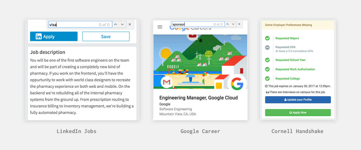
Users mainly use three kinds of platforms for job hunting: job posting platfroms, companies' websites, university career website. We choosed LinkedIn Jobs, Google Career and Cornell Handshake to investigate.
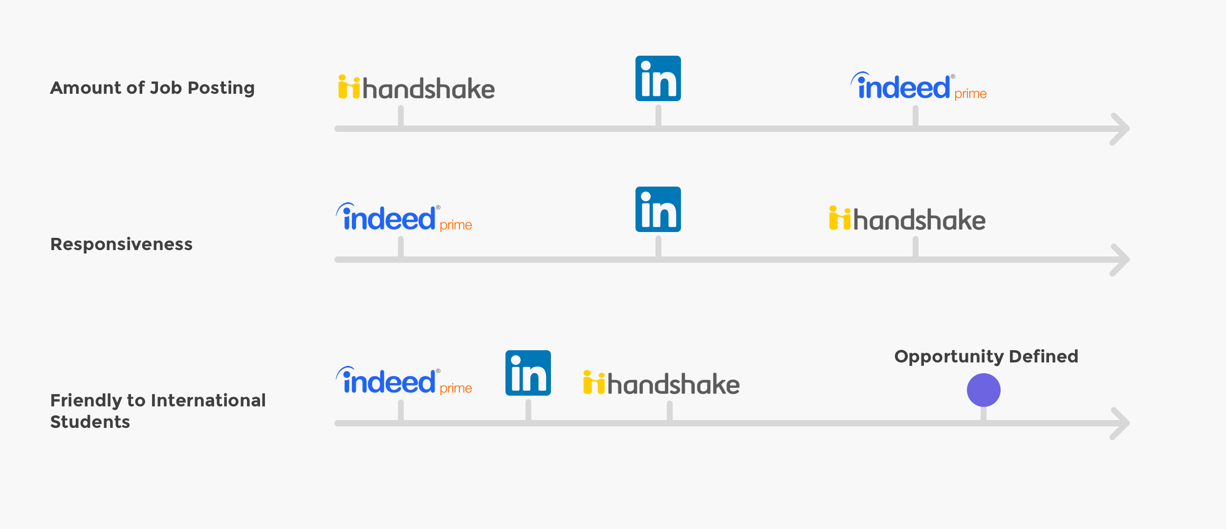
Improving the transparency of work authorization information will make the job hunting experience happier for students and also help companies to lower the costs of hiring.
Understand what are the pain points through the user journey and what are some core problems to solve.
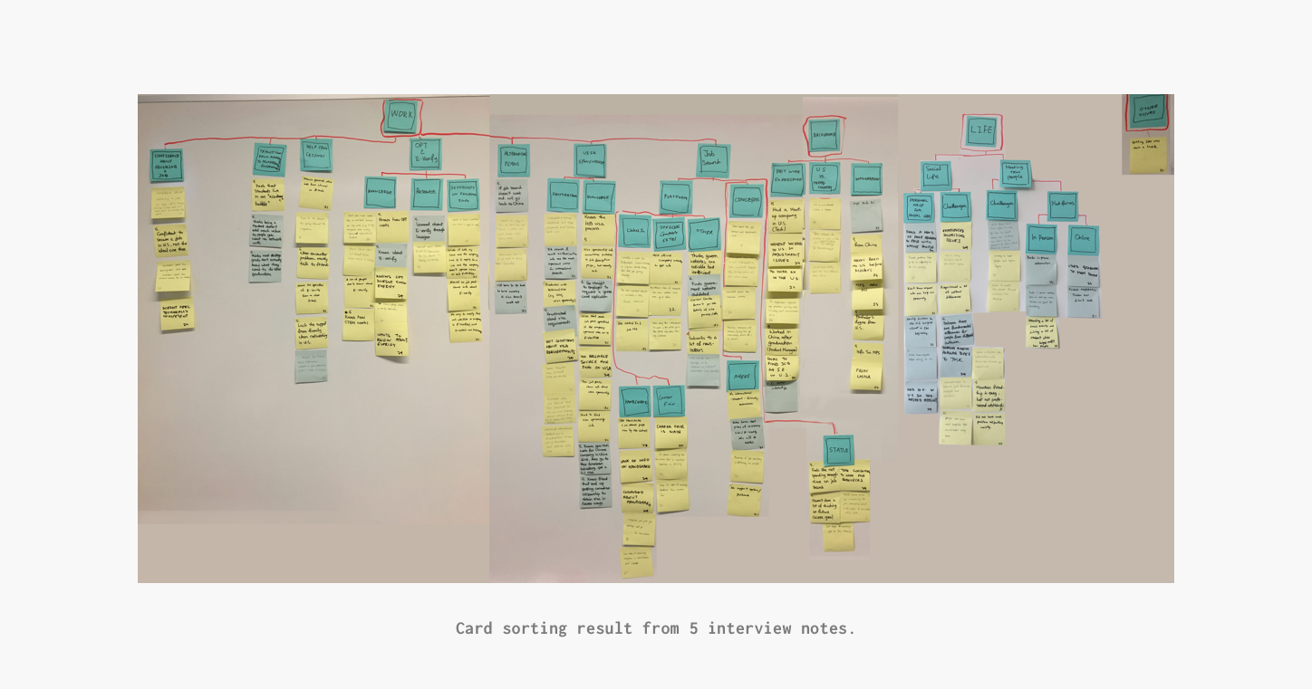
Interviewing 5 participants who are all STEM major international students at Cornell and are all actively looking for jobs, we introduced our persona Lilly Li and instilled our opportunities:
Lilly lacks the knowledge of E-Verify and other work authorization terms.

How might we educate users of work authorization policies?
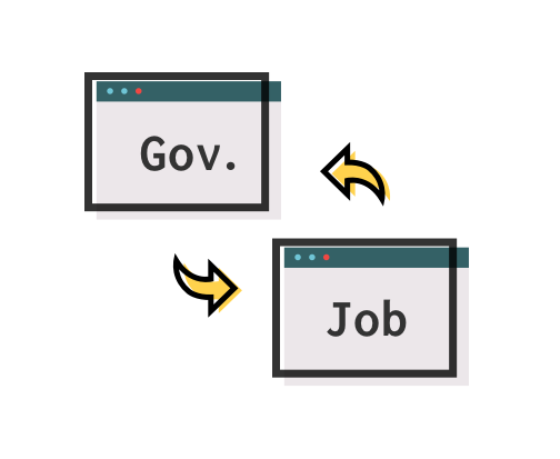
Lilly goes back and forth to check E-Verify information on the government website. Also, she finds the the list to be unreliable and outdated.

How might we provide more accurate and accessible governmental information?

Lilly finds asking HRs about sponsorship time-consuming and uncomfortable.

How might we provide a time-saving and comfortable way to acquire information form companies?

Provide a job posting platform that has work authorization information.
After discussing around 100 ideas that the group came up with, we agreed on creating a job posting platform specially for international students. Our initial design has 4 basic ideas:
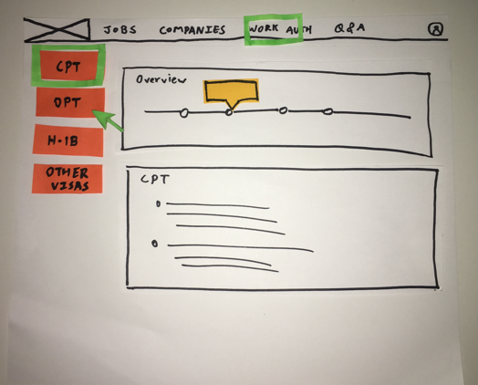
Work Authorization Education Center
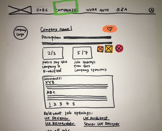
User vote about E-verify
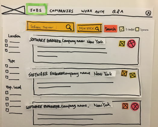
Filterable Listing Page
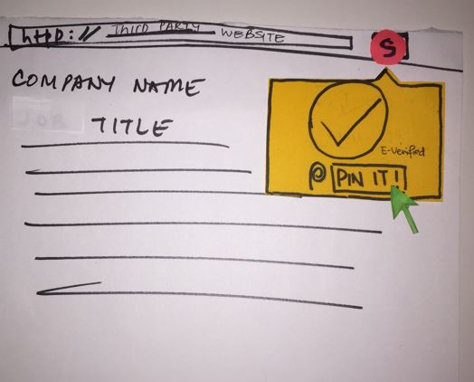
Browser Extension
Users liked our web browser extension but were skeptical about the reliability of our sources of infomarmation and also how we could compete with other existing successful platforms.
Realizing our initial design didn't work well, we revisited our interview notes to find new opportunities.

Users looked for job postings on multiple platforms, but then went back to companies' official website to apply.

Instead of building another platform to compete with other existing platforms, how might we support their actions on existing platforms?
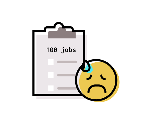
Users can apply for more than 100 jobs at the same time. But they used Excel and Bookmarks to manage it.

How might we provide more effective ways to help them manage the process of job application?
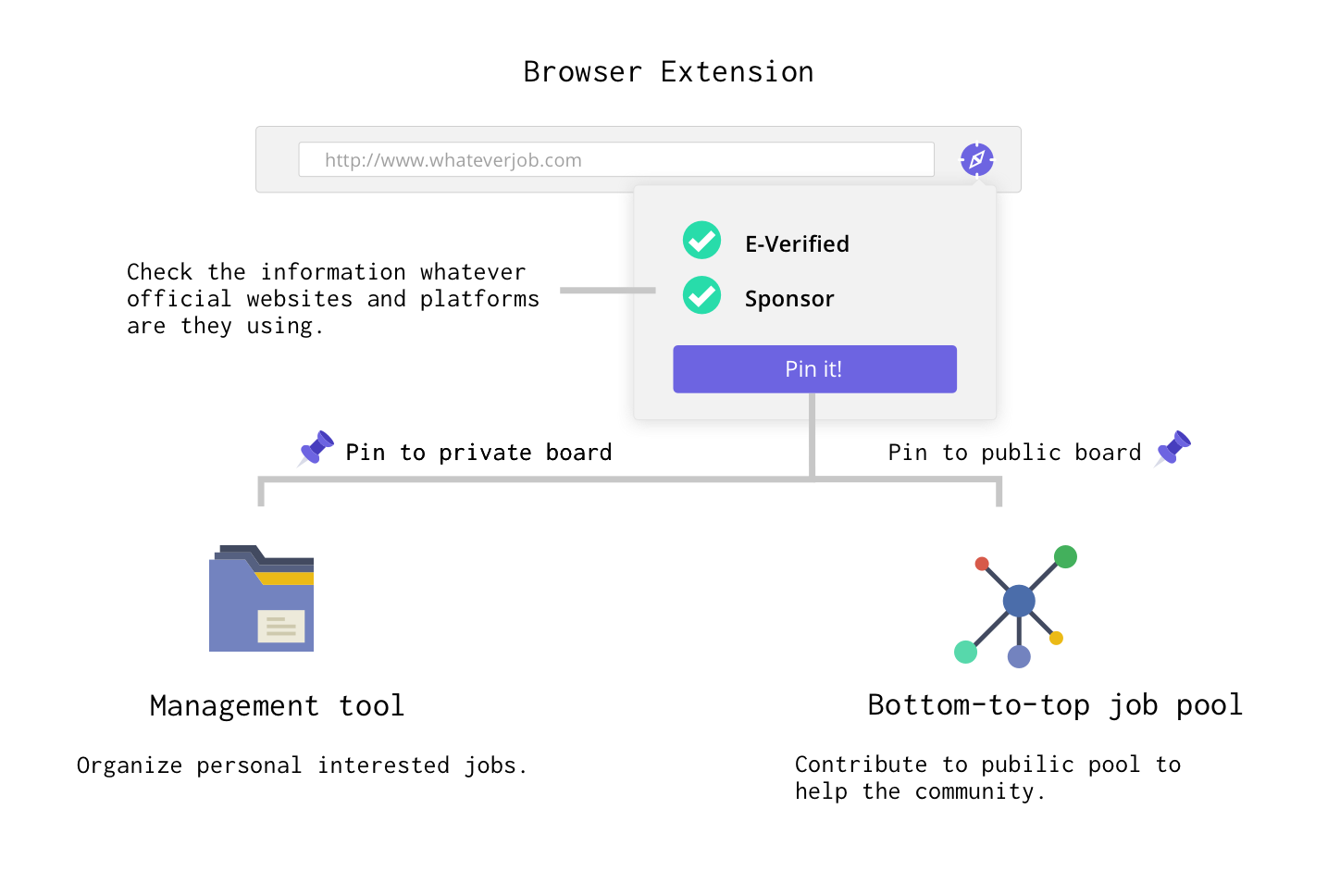
We redefined our goals: to facilitate users' applications on existing platforms and help them to manage the job hunting process. The browser extension is essential to achieve the new goal.
The new platform works like a job "Pinterest". As users viewing jobs online, they are able to check the work authorization information at any time. By "Pin" the job, they could manage interested job postings at our platform.
Is the new idea in a right direction? Is the information architecture and interface easily understandable?
Considering the time limitation, we decided to create a higher fidelity prototype using Balsamiq to test if our new approach is in the right direction and the basic information archintecture together.
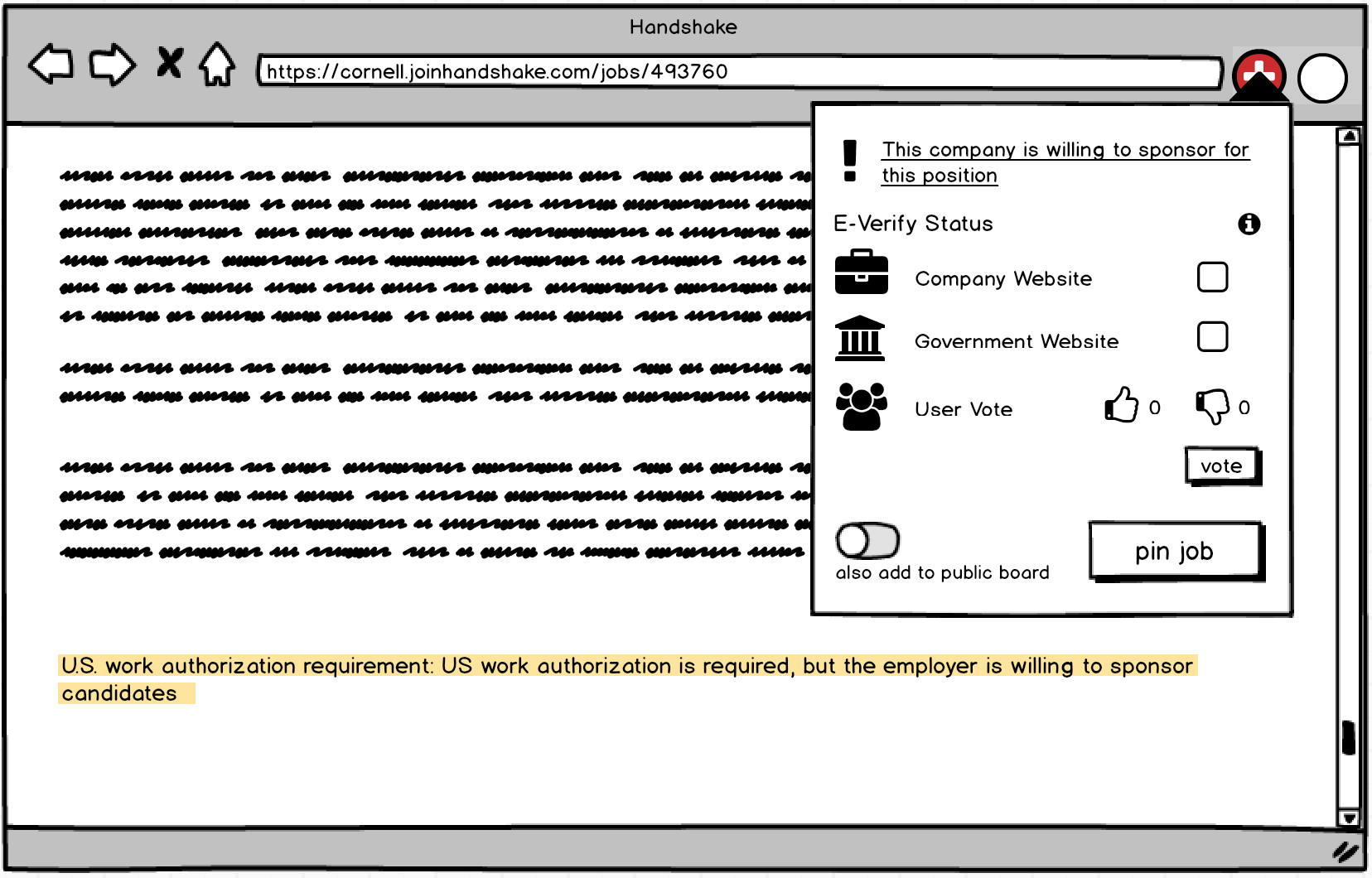
Browser Extension
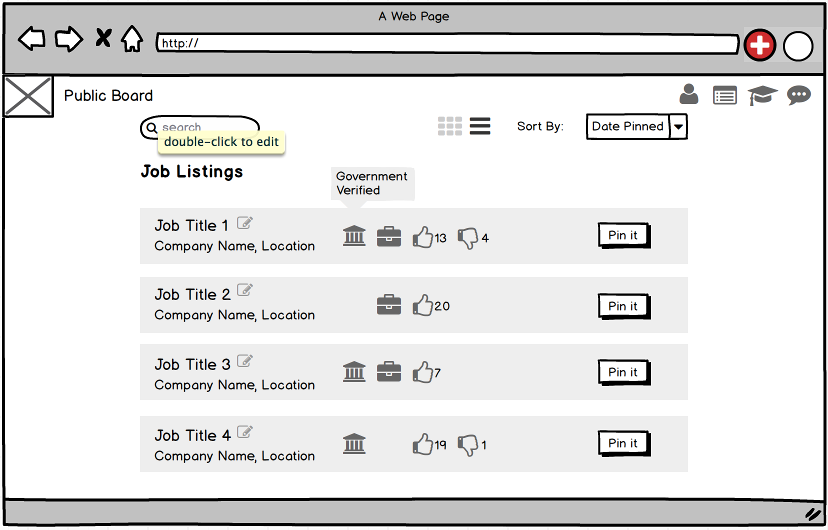
Public Board
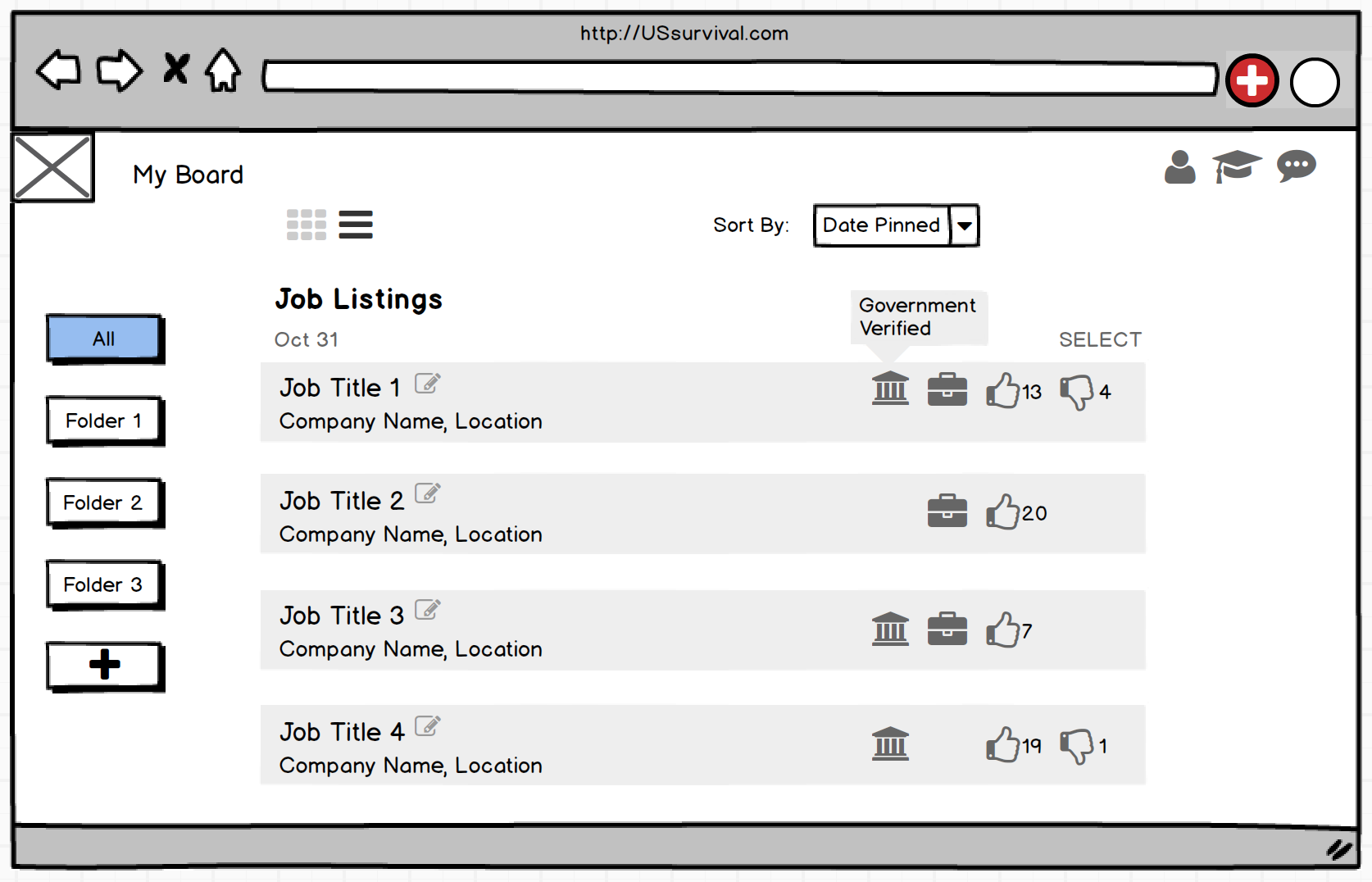
Personal Board
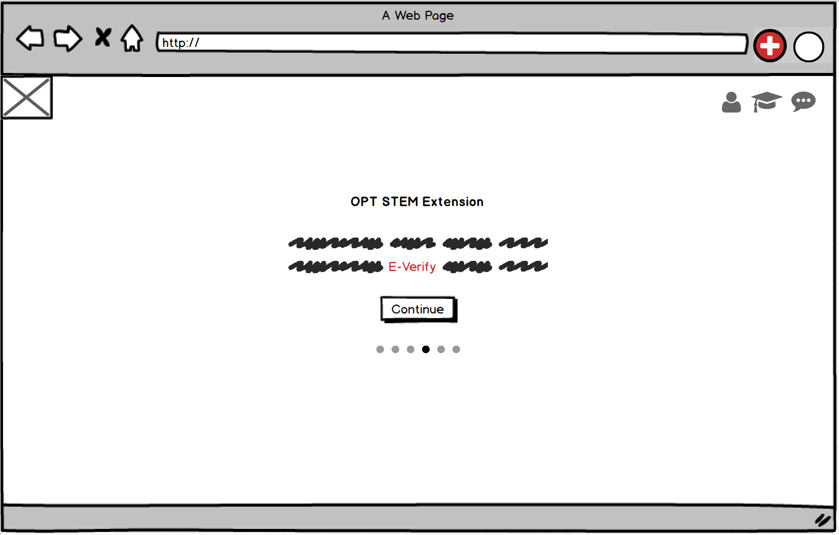
Educational Tutorial
We tested the prototyple with 5 users. They were all excited about being able to check work authorization information through the browser extension anytime. They also understood the information architecture of "Browser Extension - Personal Board - Public Board". Their concerns about the platform were:
The Balsamiq prototype was not enough for testing the detailed interactions. We created a high fidelity prototype to test the interactions.
Exploration of the main features go in this phase.
Voice from user helps us jump out of our own brain.
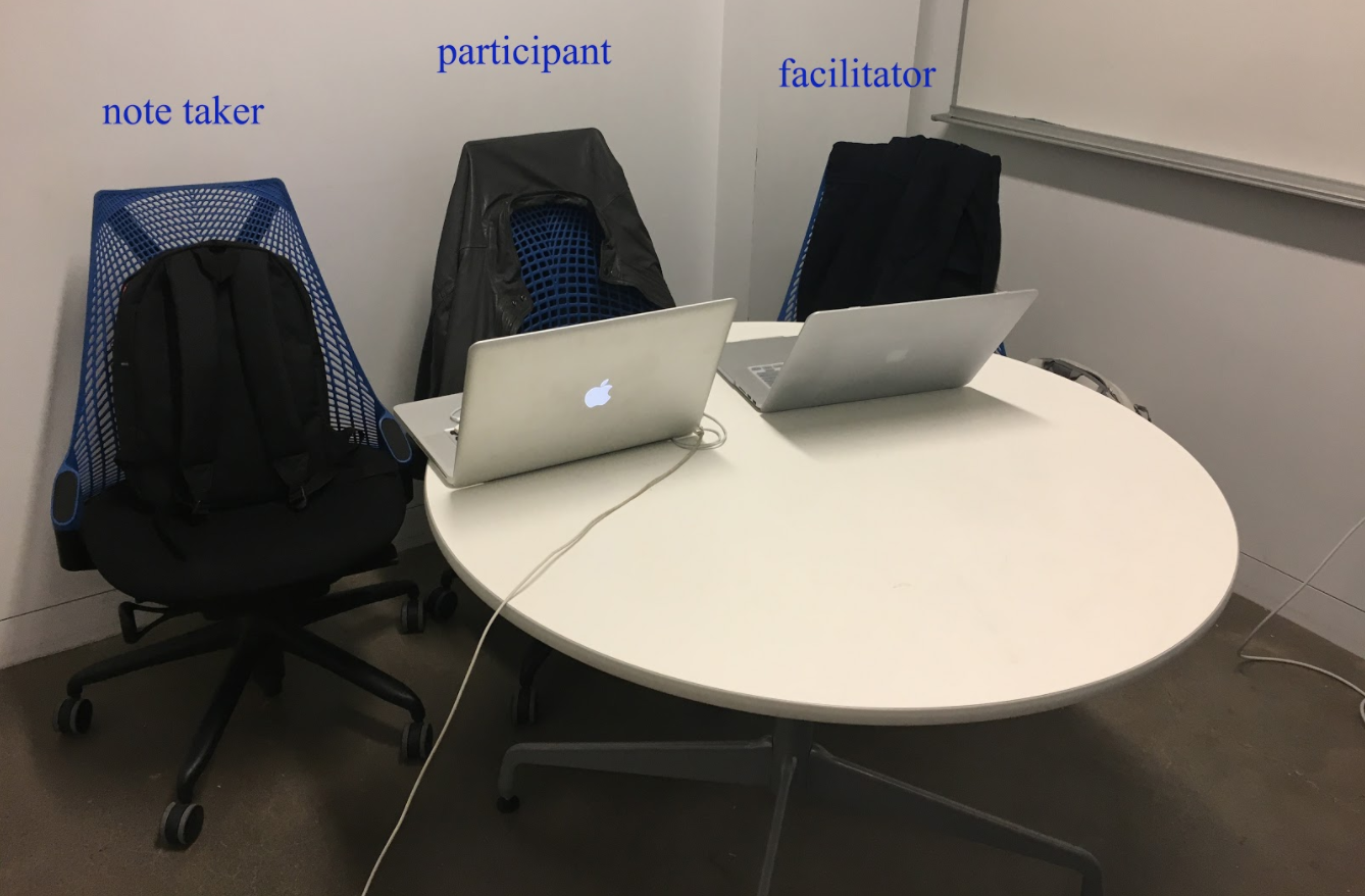
Through the Heuristic Evaluation, the system with basic UX problems excluded has worked on our own brain, but we need the voice from the user. We recruited 5 users to test the usability of our product. Users were to conduct 4 major tasks:
Following are the top 3 UX problems we identified from the usability testing:
We made three major changes based on users' feedback:
Go Through Educational Information
Pin a Job to User's Personal Board
Manage Job Postings on Personal Board
Bottom-to-top Public Job Board & E-Verified Company List
We haven't spare enough thoughts on how to help people to manage job application process more effectively.
All my teammates were happy about the result we got and aspire to work together to implement it. But I want to ask ourselves two more questions before we move on:
I look forward to go back to work on those new opportunities soon.😁