
Cat owners cannot find a way to help cats lose weight.
In 2015, our clients Paul Cashman ‘73, a cat lover and developer, asked Dr. Bruce Kornreich DVM ‘92, PhD ‘05, a veterinary cardiologist and associate director of the Cornell Feline Health Center about ideas for apps that could help cat owners, veterinarians, or feline health researchers manage cats' health. This app aims to improve the health and well-being of cats, by helping owners manage the cats' weight through four steps: planning the weight loss, selecting foods that fit within the weight-loss program parameters, monitoring the daily feedings, and tracking the cats' weight-loss performance.
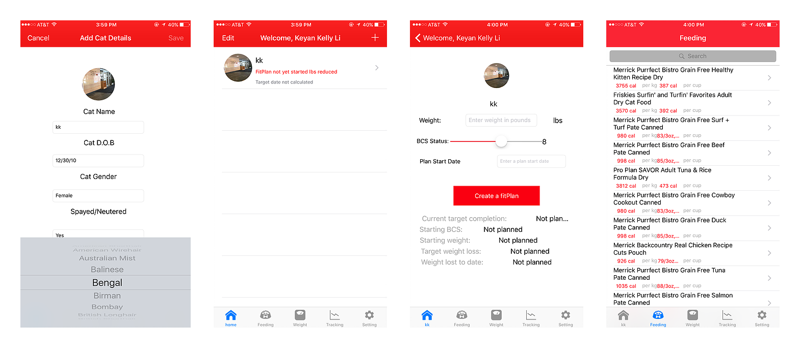
In the Spring 2016 semester, a team of students designed and built version 1.0 of the app and passed the project to us. Originally, our goal this semester was to design and implement the rest of the features. This is what version 1.0 looks like:
Need to get rid of the data-type-based information architecture.
I believe a good information architecture always leaves room for future features. However, when I saw the app, the first problem that stood out to me was its navigation:

As a result, we decided to redesign the app in a more user-friendly and business-friendly way. But at the same time, we will make the most of the previous code to avoid unworthy effort.
Sketching out the cat owner's profile helps us conclude the requirements of the app.
Before we dove into the design, we did research on cat owners and distilled some interesting facts:
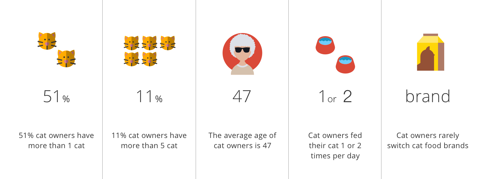
Based on our findings, we came up with the key goals for FitCat 2.0:
Introduce a new cat-identity-based information architecture.
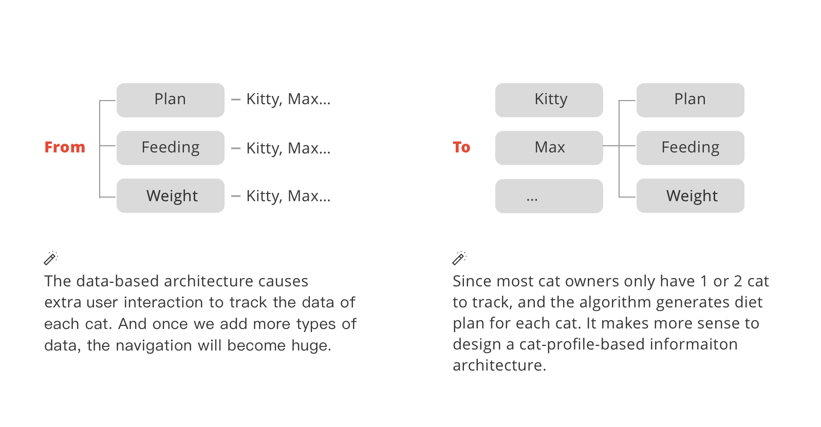
Based on the reflection on FitCat version 1.0 and the user research, we decided that the most important change we wanted to make is to change the data-type-based tab navigation/info architecture into a cat-identity-based one. In this new design, The navigation page is a cat card page that holds links to different cat profiles. The cat profile page is the main page for feeding and tracking.
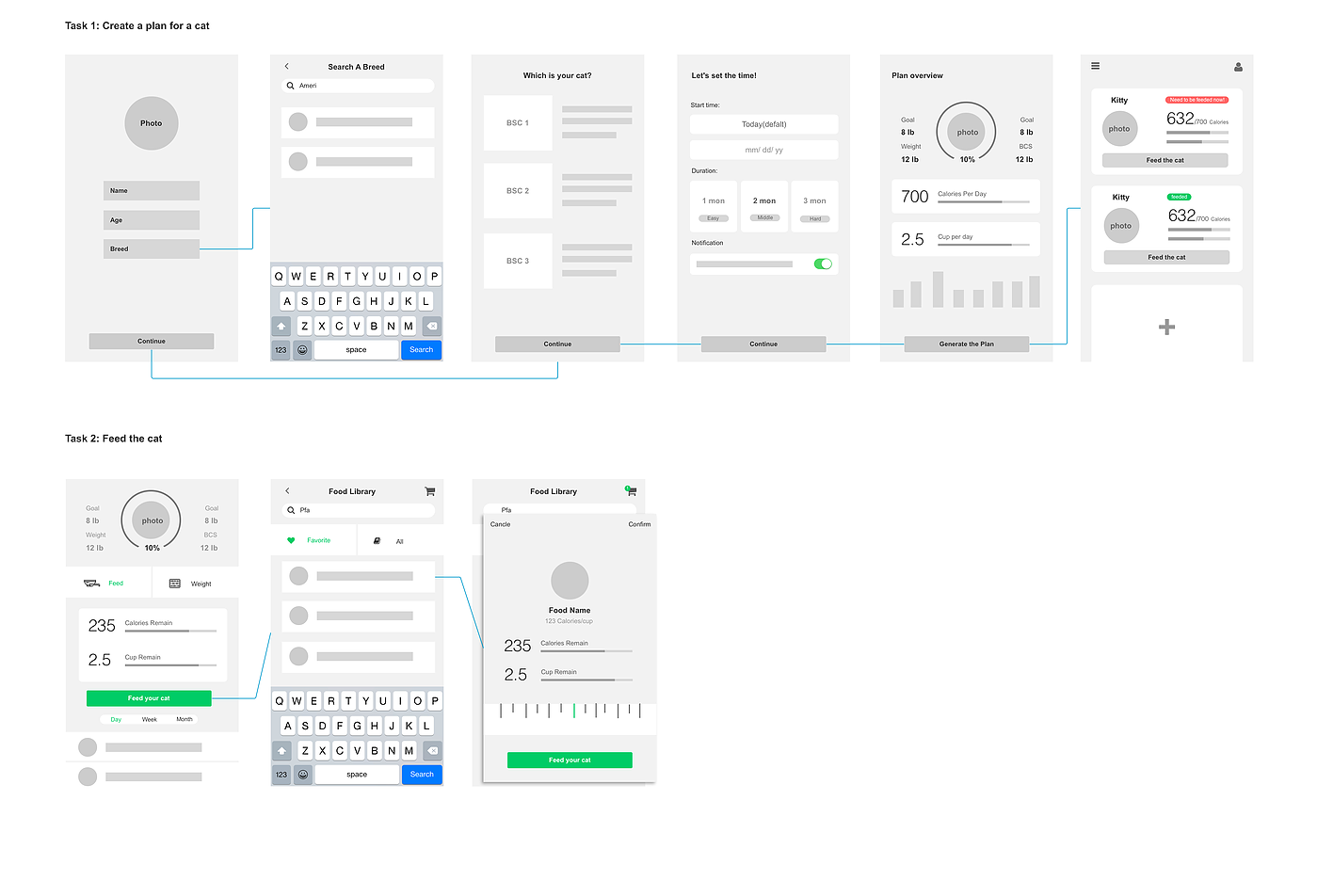
Define two major tasks: "Generate diet plan for a cat" and "Feed the cat."
Based on the cat-profile-based architecture, the system should have two main tasks:
Since we needed to finish the design and the implementation within one semester, we decided to have an agreement on the visual style before diving into more detailed interaction design. Thus, I came up with the visual design for the two major tasks.
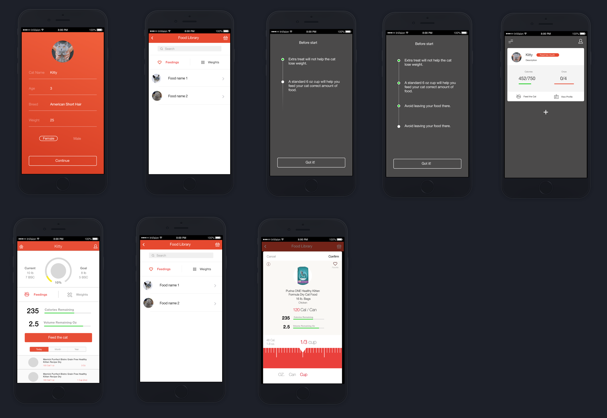
Matching experience with the real world feeding works better to the elder.
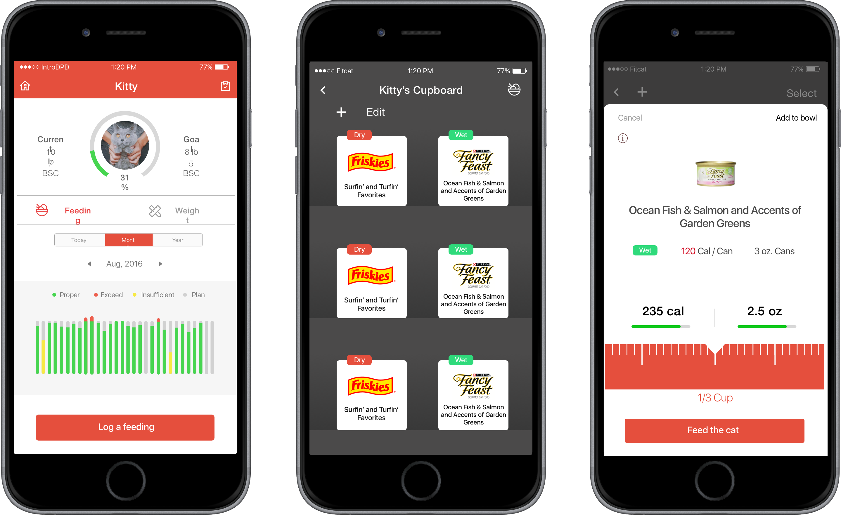
The first discussion about iteration was around the "Favorite Food" page. In the former user research, we found users normally stuck to the same brand of food and thus decided to have a "favorite food" page that holds all of their favorite foods at home. I got the inspiration of designing this page from music apps. The original page had two tabs: one was "All", which listed all the foods in our database. Another tab was labeled "Favorite." Once the user marks a food from "All," it goes under the "Favorite" tab.
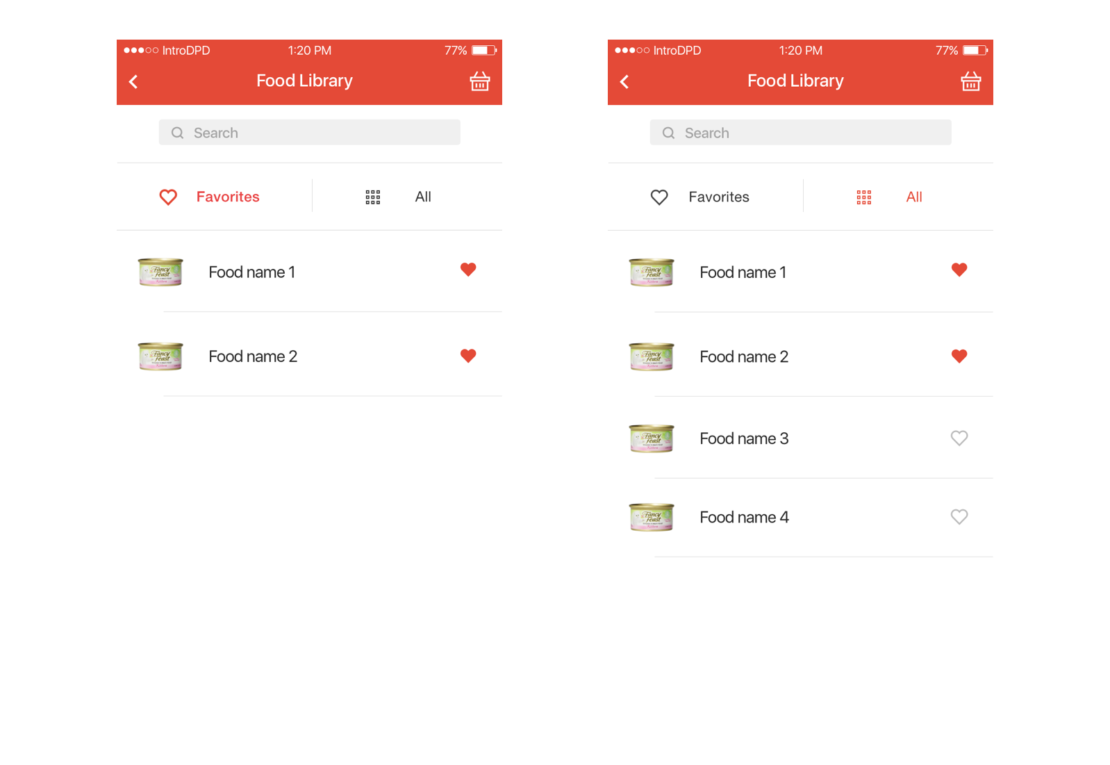
Then, we had a critique session with our clients Paul and Bruce. Because the elderly are not familiar with the "like" functionality from music apps, it was hard for them to understand the "Favorite" tab in our first design. The new challenge became how to design the "Favorite" functionality in a way that makes sense to the elderly.
During the meeting, Paul mentioned that he wanted to name the feeding function "Kitty's bowl," which gave me the inspiration of borrowing the experience from real life rather than from similar digital products. I then introduced a design called "cupboard." The cupboard will hold users' favorite kinds of food and have an extra food market where users can add food to their cupboard.
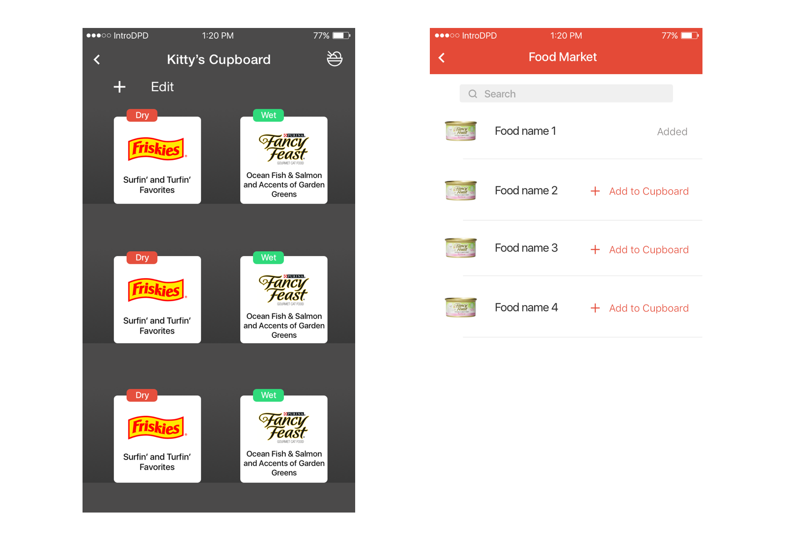
The cupboard design became the most acclaimed feature in our user test. Participants thought it was easy to understand and easy to manage.
Visualization of the process motivates users and informs them of cats' statuses
Another important part that we hadn't looked into was the visualization of historical data. There are two goals of data visualization in this app:
To achieve these two goals, we needed to decide what kind of data is meaningful and how to make the visualizations easy to understand and pleasant. We came up with a list of data and their visualization forms.
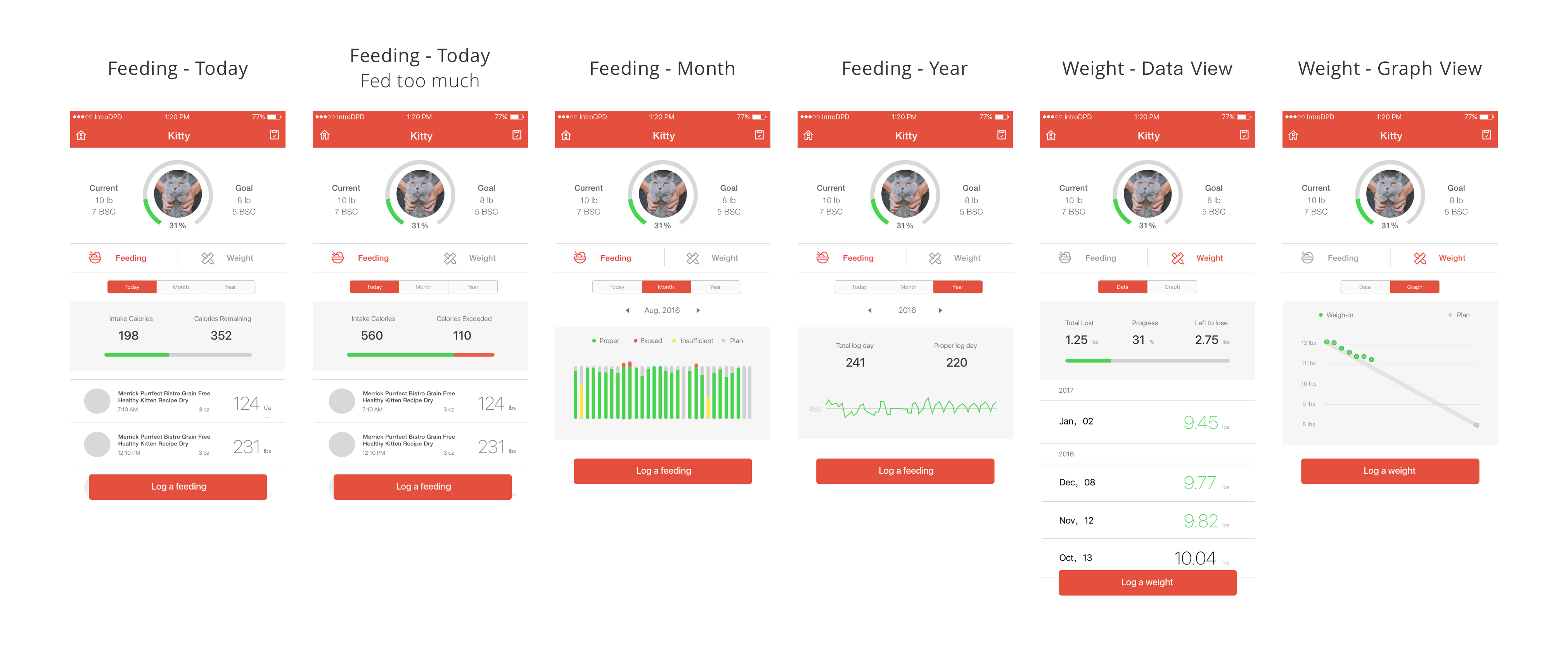
Also, we wanted the users to be aware of how many calories each meal has as well as when a feeding exceeds the total calories amount, and in turn the users can adjust their cat feeding habits. So we made the progress bar for today's feeding consistent throughout the whole app.
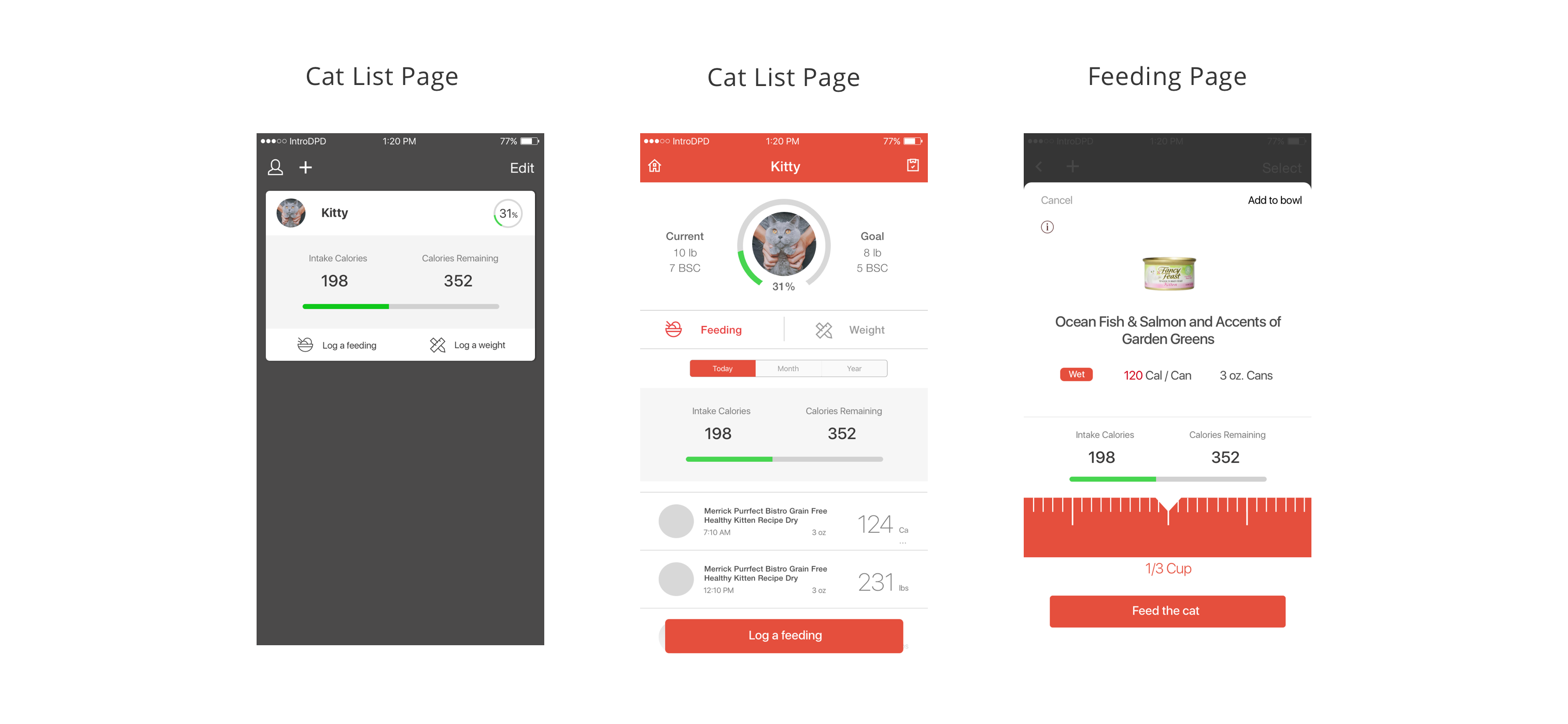
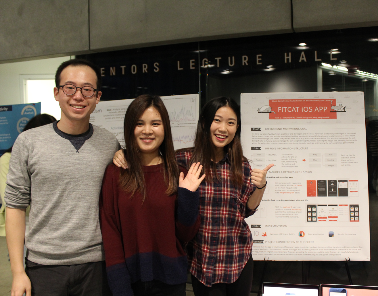
In the post session, our project won the "best project". Check out what FitCat looks like after the first iteration of development:
Now, FitCat is still under development, and I am still improving the design. We look forward to introducing FitCat to the public in the near future.
