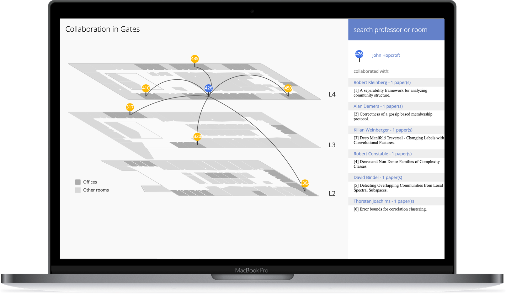

Data visualization is a power tool to reveal hidden relationships. In Gates Hall, professors from Cornell CIS Department work closely to push the boundaries of technology. Their great collaborations are reflected on the papers. But is there any relationship between their collaborations and the physical position of where they work every day?
Our project was featured and got the highest score of 2017.
Click to View the Demo 👉

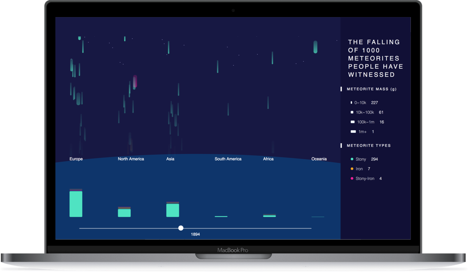
Data visualization is a game of dimensions. Time, distance, volume, things that are hard to observe at one time in realife can be perceived together through a simple dynamic data visualization.
With this project, people are able to experience the falling of 1000 meteorites that people have witnessed in human history all over the world.
Click to View the Demo 👉

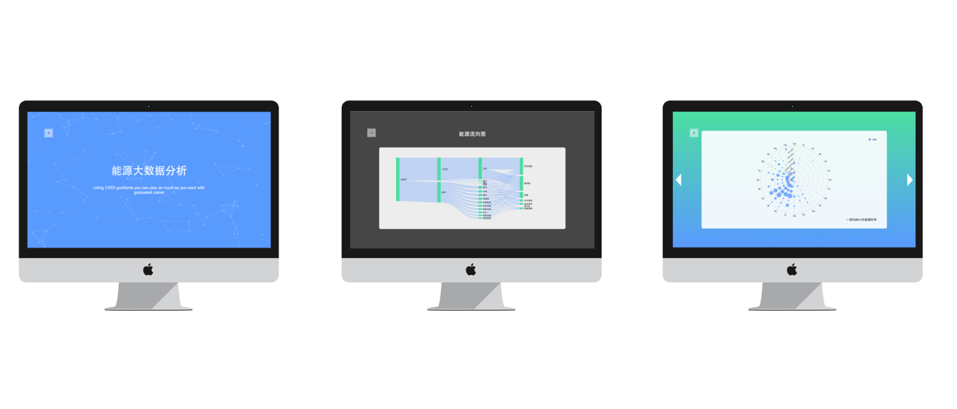
Designed and developed a website for visualizing campus energy consumption using Echarts.js and D3.js.
